Sunday, April 25, 2010

untitled141


Something for my girl, pencil on a3 paper~why blue? because its her favourite color ^@^o^

Saturday, April 17, 2010

Untitled140


Referenced from HULK by Marko Djurdjevic

Untitled139


My Figure Sketching assignments, all of these are done in A3 layout pad, I've learnt alot in this semester, learnt about the ideal proportion of human head, facial features, shading techniques, tonal values, composition, overall feeling and finishing of the artwork. I hope you can see the improvement, from the earlier piece to the bottom one, because i can see them myself. Even so, i still cant capture one's feature that well, and thus most of them doesnt really look alike to the reference. Comments and critiques are welcome, thank you very much for viewing.

Untitled138


>This is the first still life drawing my lecturer asked us to do in the first class, before any lessons were carried out, to see how much we know about still life drawing.
=============================================


>Line drawings, we're required to observe the form and structure of the still life we're going to draw, and at the same time, maintain a perfect proportion of each object, the distances and the thickness, based on the "form forms form" theory. You can see the objects were getting more and more complicated as the lesson continues.
=============================================


>These are the home assignments, at first we're required to draw 2 versions, which is the form study, and the value study. After that, we're asked to draw a complete value study based on what we've got in our real life, we can choose the topic ourselves, and which is why i enjoy it alot during the process.
=============================================


>We started to do shading this time, i've learnt about tonal values, light and shadows, types of shadings, and composition in each lessons, I realized my proportion is still not very good, the same for the value changes, and overall finishing. Some times i'm too rushed, and sometimes i'm too easily self satisfied, which is a very serious problem for an artist. I shall never repeat the same mistake again, thanks alot to my lecturer, Yanning and Hoean for the guide thruout the whole semester. I put out my best in the final piece, which is the exam, and i quite like the result of it, i wasnt rushing, i tried to carry out each stroke carefully and neatly, i keep the proportion right, planned a better composition, and finished it tidily. It wasnt the best compared to others, but i've tried my best by applying everything i've learnt into that final piece. I hope i didnt disappoint my lecturer, I will post the artwork here after its given back, thank you very much for viewing. Comments and critiques are always welcome!

Monday, April 12, 2010

Untitled137


History of Arts and Design 1, Semester 1 Final Project, Advertising & Reinvention Campaign.

Theme: Apocalypse
Tag line: Make your last bite worth it.
Description: If you're going to be devoured by giant chicken or killed by laser eyes, why not enjoy your last bite of Kentucky Fried Chicken? It's definitely worth it!
Promoting : Kentucky Fried Chicken

Photographed and edited by : Wong Voon Fei
Background Photomanipulation : Kael (me)
Software : Adobe Photoshop cs4
Time taken : 2 weeks
Stock Photos : Stock.XCHNG

Tuesday, March 23, 2010

Untitled136


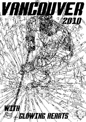
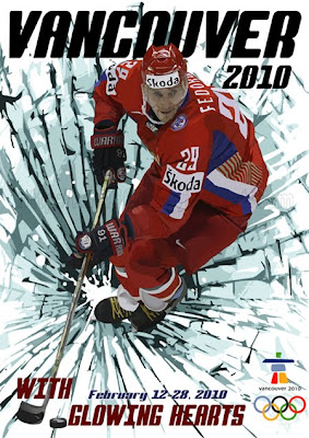
COMPUTER GRAPHIC DESIGN - Tracing picture using only Adobe Illustrator CS4, took me 1 week on and off~
=============================================


My computer graphic design 1st semester final project, we're required to create a sports-themed poster based on two sports category; Winter Olympic Games or FIFA World Cup, and I finally chose to do ice hockey for winter olympic games. This is what I came up with, everything was done in Illustrator cs4, learnt alot. Do tell me what you think, any suitable elements to be added or removed, thank you very much!

:: Adobe Illustrator cs4

Tuesday, March 2, 2010

Untitled135


Finished art, Mock-up and Paper Engineering class assignments~

Wednesday, February 24, 2010

Untitled134


Requested illustration for ~F-one-R's 2nd volume of his graphic novel; SMASH20 which is going to hit the market soon!

(Please forgive me for the anatomy flaws, didnt practise anatomy for quite awhile T_T)

©Character EHSAN belongs to ~F-one-R's SMASH20

Monday, February 22, 2010

Untitled133


My DESIGN class assignments, most of the paintings are done using ACRYLIC colors, and the details are done by UNIPIN pens~

Friday, January 1, 2010

Untitled132


Another sketch, referenced from manga Umizaru (海猿) by Shuho Sato. Pen on paper

Monday, December 14, 2009

Untitled131


a quick sketch i did during evening, this is my workspace ;)
speed painted in Photoshop cs3. Some pasted elements there!

Wednesday, December 2, 2009

Untitled130


Why the fk did i drew her for? I fkin dont know. Tomoro is Physics and I'm still fkin painting, my head is fkin aching, why is her hand halfly done? because i'm a fkin asshole. And why the fk am i keep saying tat fkin word? Because I'm a freakin fkin dude.